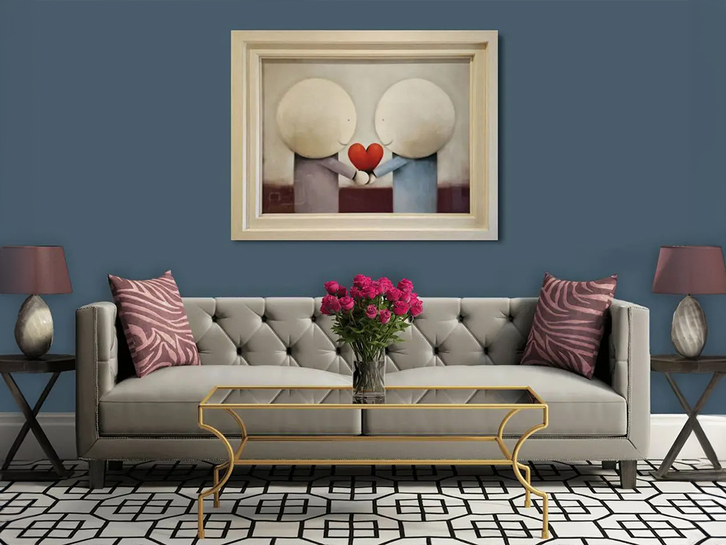
When buying art, one of the first questions most people ask is “how will it look on the wall?” And, when undertaking an interior design project, this question becomes much more high stakes…
Should you find a painting that matches the sofa? Or the other way around? Should you wait until you have decorated your entire home before you start to look for original paintings, prints or sculptures to buy, or should you buy all your art first? There are endless questions to ask, and we have a few rules to follow when answering them.
Rule One: There are no rules
This should possibly have waited until the end and been presented as a surprise twist… as an art marketplace representing a wide range of art genres and styles, we believe that there really are no rules that should determine which artworks you take home, beyond the most fundamental question: do you love the artwork? If it’s a “yes,” then that might be all you need to know.
However, there is a world of difference between liking the idea of an artwork and actually loving it in your home or office. Our guide for choosing the right art for your space is all about determining the way an artwork makes you feel, and whether that works with the intention behind your interior design. Our “rules” are general recommendations based on our team’s extensive experience in offering assistance and advice to art collectors.
Rule Two: Start with the art
If you already have a few artworks that you love, make sure to take these into consideration before choosing your interior style. Not only will this alleviate any worry over where to place the art after you have finished, but the art styles you love can often provide deeper insights into your personal tastes and preferences.
You can use elements of the artworks themselves to help start your interior design planning, using the colours, textures, content or tone to start finding ideas and inspiration for wall colours and furnishings.
For those who are still seeking the right art to buy for their perfect space, you can still plan your design around your art preferences. Try making notes on the artists and styles you love, even if you haven’t found your dream painting or sculpture just yet, so the space will be ready when you do.
Rule Three: Complement or contrast
If you have already designed your space and are selecting artwork to work within your design, one of the most important considerations is the visual impact of the art on the space around it.
You might want the artwork to complement your design, such as choosing a bold, bright piece to go in a light, airy living room. In a dark-walled, bookcase-lined study, you might choose something vintage and moody. In both these examples, you are creating a sense of unity and cohesion, settling the artwork into its surroundings.
However, you can also use your artwork to bring a contrasting element into the space. For example, choosing a highly contemporary artwork to place into a traditionally decorated period property will highlight the different elements of both the interior style and the artwork.
Rule Four: Emotional impact
Art will always have an emotional resonance with its viewer, and when placing artworks in your space it’s important to consider how each artwork makes you feel. If an artwork makes you feel excited and energised, it is probably best suited to a living room, work space, or transitory area like a hallway. Relaxing, calm artworks will be naturally more suited to a bedroom.
When you are choosing artwork for a newly decorated or refurbished space, take time to stop and think about how the room will look and feel when it is actually in use – not just how it feels right after the designer has finished staging it!
Rule Five: Focus points
Art will automatically become the focus point of any room – which is why it is always important to consider your art choices from the beginning. However, you can also use artworks as a physical focus point. You can control the design of a space by where you place an artwork, such as placing an artwork in a corner of a room along with an armchair to create a nook.
You can also define a space through the way different artworks interact with each other. A set of artworks in matching sizes, placed at equal intervals across a wall, will give the room a structured feeling. Depending on the rest of the room design, this might feel a little formal, but can also bring a sense of calm. Conversely, an asymmetric placement of artworks will feel more casual – and a ‘salon wall’ of mixed sizes and shapes will bring a much higher level of energy and excitement into the room.


